Paul
Langland
Design
Logos
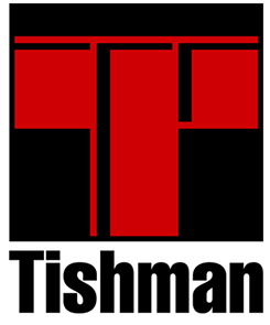
Tishman Realty & Construction
This company builds office towers using heavy steel and concrete construction. Their original mark was a 1950 style perspective illustration of crossed I-beams forming a T with the letters “ishman” next to it. They wanted to keep the concept of the crossed I-beams, but it needed to be more contemporary with a clearer presentation of their name.
Click image for additional views