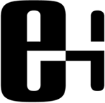
Evergreen Health Management
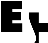
This client was a combination of mail order prescriptions and temporary nursing care. They had a number of criteria to be considered, including: people oriented, friendly, high-tech, and pharmaceutical. At left are the three final logo choices, each taking a different approach, with the top one being the preferred choice. The bold type with rounded corners portray a strong, but softer nature. I highlighted the E with an H being formed by the mirroring of the interior shapes, with the plus of the H symbolizing the appearance of people coming together.
Click image for additional views