Djangomatics
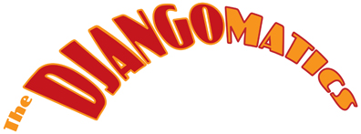
The logotype here is for a band that fashions themselves after a 1940s style of music. Their mark needed to be dynamic, as well as visually having a 40s, retro look. The curved variation was intended to be applied to objects like a CD more easily.

